Glazing and the illusion of volume
By Al R. Young
 |
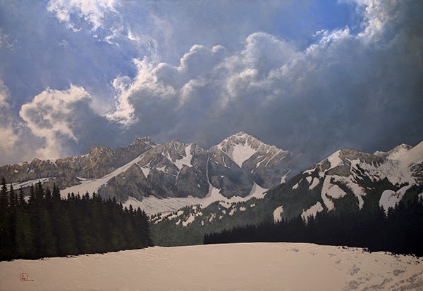
| Den Kommende Våren by Al R. Young |
By Al R. Young
The commission to paint two scenic focal points for the Stein Eriksen Lodge Deer Valley conference center renovation included both the original oil painting and its gilded frame.
Dimensions (width x height)
69.5 in. x 48 in. (unframed)
Support
Panel
Milestones
Research begins - November 2012
Composition begins - January 2013
Brushwork begins - January 2013
Frame completed - May 2013
Equipment
Creating a painting often involves creating or modifying tools or making improvements to the studio itself.
Building a horizontal panel-support for the $10 easel
Remodeling the palette cart
Creating a piano-leg brush holder
Creating a wood-brick brush holder
Methodology
This section presents only one or two items that may be of interest to professional artists, amateurs, and others interested in the work of the Studios.
I use two kinds of glazes: A thin (watery or translucent) glaze and a dry-brush glaze.
Translucent glaze
Watery glazes consist of pigment suspended in a lot of medium. Because of the ratio of paint to medium, such glazes are translucent and therefore add color by tinting the color of under-layers. Depending upon the topography of the under-layers, a translucent glaze tends to pool in depressions in that topography so that opaque puddles of the glaze introduce form as well as color. For example, a dark, watery glaze applied over the knifed-on rocks of a mountainside can pool in the depressions of the knife-work and add slivers and pocks of shadow that accentuate, refine, or otherwise re-define the rugged angularity of the rocky cliffs. Ragging and rubber-tips also present wonderful possibilities for working with glazes, whether translucent or not, but a discussion of those options awaits another commentary.
Dry-brush glaze (scumbling)
Strictly speaking, a dry-brush glaze might be considered simply an alla prima application technique, but since I use the application like a glaze, I think of it as such. Also, I do not always use the glaze to soften the appearance of the under layer (a result often associated with scumbling).
Preparatory to the application of the glaze, I load the brush with a small amount of paint and then swirl, smear, and otherwise work the bristles around on the palette or wipe them on the denim that I use to clean my brushes. The objective is to evenly distribute the paint among the bristles. When I'm satisfied that touching the brush to the painting will not result in an opaque blob of paint, I either rake the bristles over the topography of the area to receive it or stipple it onto the area. I sometimes work wet in wet and sometimes only wet on dry. It all depends on the result I'm after. In the finished version of Den Kommende Våren, the dusting of snow across the peaks is yet one more dry-brush glaze.
Stippling almost always works well for haze or fog. And yet, if blending and evenness of resulting tone are to result in a particular hue distributed over a wide area, I find that this technique also works very well over expansive regions of clear sky. (I'm talking about a very vigorous pounding of the toe of the bristles onto the surface of the painting, while holding the brush handle perpendicular to the panel.) In such instances, I often use the largest hog-bristle flat I can get my hands on. Such was the case with the final layers of the sky in Den Kommende Vinteren as well as Enchanted Stillness and other landscape tone poems completed during that particular phase of my work.
On the mountains featured in Den Kommende Varen, the initial layer was applied by painting-knife (the thin-bladed and springy diamond-blade painting knife that I use most often). After working with the initial layer to the point that I was ready to add highlights suggesting sunlight on the high places, I used a dry-brush glaze to achieve the effect. The direction of the strokes employed in applying the glaze were, for the most part, perpendicular to the strokes by which the under-layers have been applied. This juxtaposition of brush strokes significantly enhances the verisimilitude of volume associated with the resulting image. It is as though the layers, floating over each other, combine not only their colors, but the directions of their strokes to create a literal distance between the layers--a distance that actually enhances the illusion of volume, as though the mind, while assembling the image, had to travel from one stroke-direction to another, with the result that the journey is added to the volume column in the mind's perceptual model of it.
My project journal for this painting contains this statement for the date on which I applied the highlight glaze:
I ragged off the ridges and shapes to be highlighted, and then applied the highlight color, by brush, to the rocks to be highlighted. I did not apply it to all the highlighted areas because I did not want all the contours of the mountains to appear in the same visual plain. I also wanted to suggest that shadows from clouds were at play above the mountains.
 |
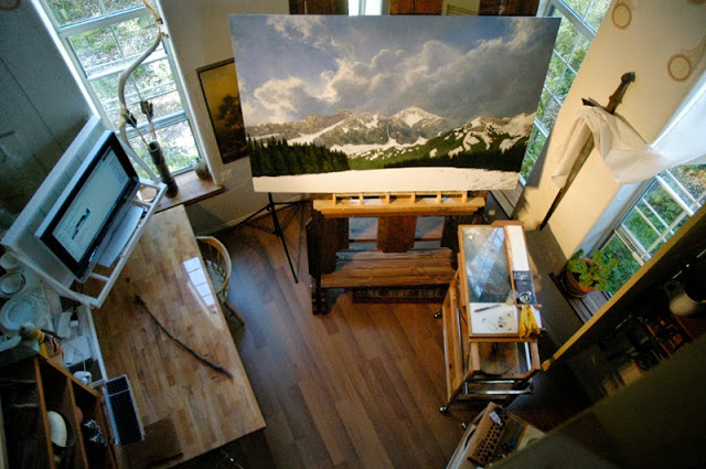
| Studio configuration for a painting session on Den Kommende Våren
Visit us on Pinterest to see more photos of this and other stages of the Stein Eriksen Lodge Deer Valley conference center project. |
Tags: Den Kommende Våren, 2013, Project commentaries, Tips and techniques
Browse articles by year: 2025 . 2024 . 2023 . 2022 . 2021 . 2020 . 2019 . 2018 . 2017 . 2016 . 2015 . 2014 . 2013 . 2012 . 2011 . 2010 . 2009 . 2008 . 2007 . 2006 . 2005 . 2004 . 2003 . 2002 . 2001 . 2000 . 1999 . 1998 . 1997 . 1996
Browse articles by topic: Art lessons . BenHaven Archives . Blank art diaries . Fine art photography . Framing . Illustration . Inspiration and creativity . Isles of Rune . Limited Editions Collection . My Fathers Captivity . News . Novellas . Oil paintings and prints . Operations announcements . Orders and shipping . Overview . Portfolios . The Papers of Seymore Wainscott . Project commentaries . Recipes by Nancy Young . Recommended reading . Recommended viewing . Temple artworks . The Storybook Home Journal . Tips and techniques . Tools supplies and operations
Browse articles by topic: Art lessons . BenHaven Archives . Blank art diaries . Fine art photography . Framing . Illustration . Inspiration and creativity . Isles of Rune . Limited Editions Collection . My Fathers Captivity . News . Novellas . Oil paintings and prints . Operations announcements . Orders and shipping . Overview . Portfolios . The Papers of Seymore Wainscott . Project commentaries . Recipes by Nancy Young . Recommended reading . Recommended viewing . Temple artworks . The Storybook Home Journal . Tips and techniques . Tools supplies and operations